Victor Ohiri
Tara Designs
A four-page site for an architecture and graphic design studio.
- Role
- Design and development
- My part
- I built the site and chose its typography.
- Supplied by
- The studio supplied the photographs, names and copy.
- Stack
- HTML, CSS, JavaScript, Canvas 2D
- Elsewhere
- Visit the live site
tara-designs-creative.vercel.app
A-01 / A-08
The idea
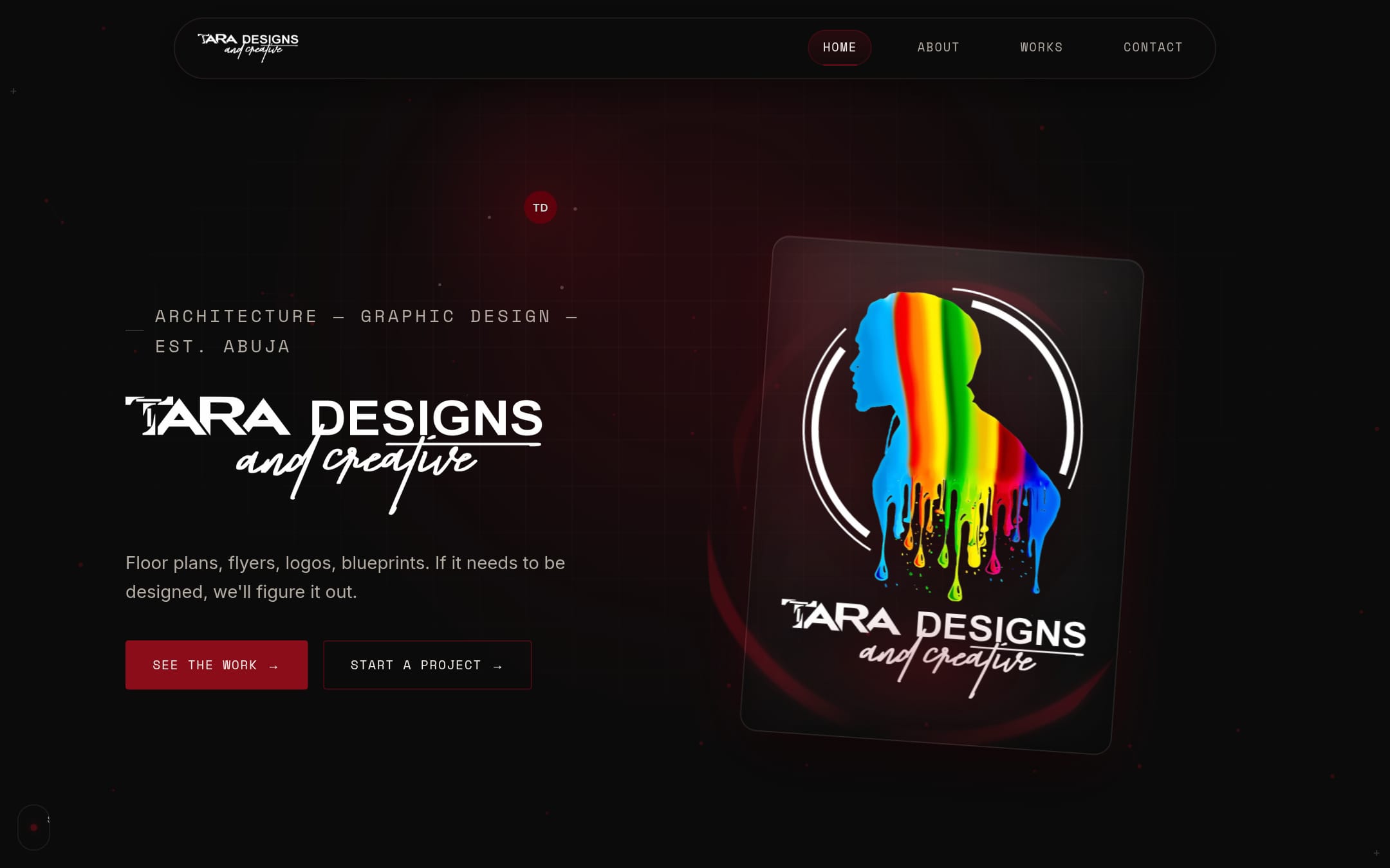
Four pages, a filterable gallery and a contact form for an architecture and graphic design business.
A-02 / A-08
The problem
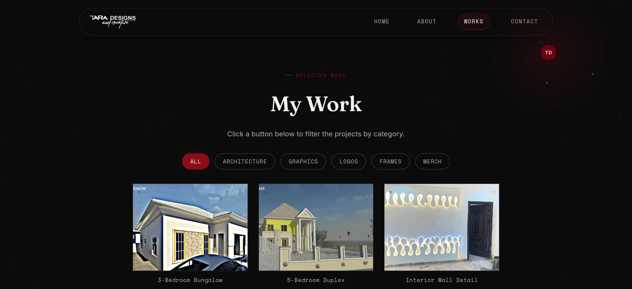
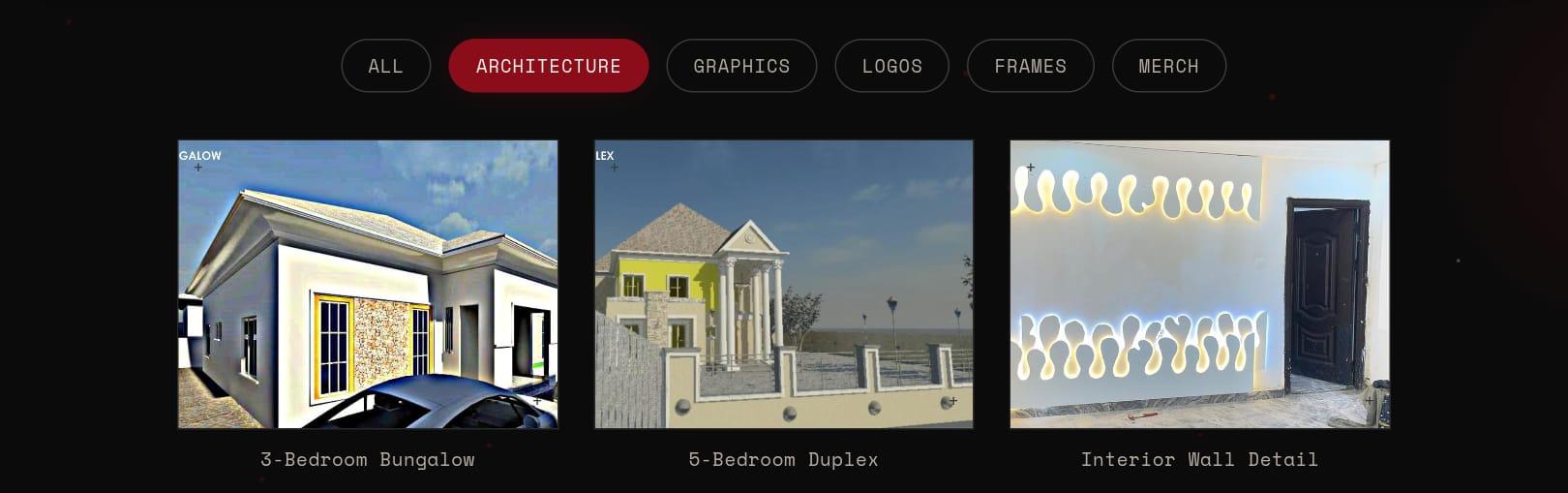
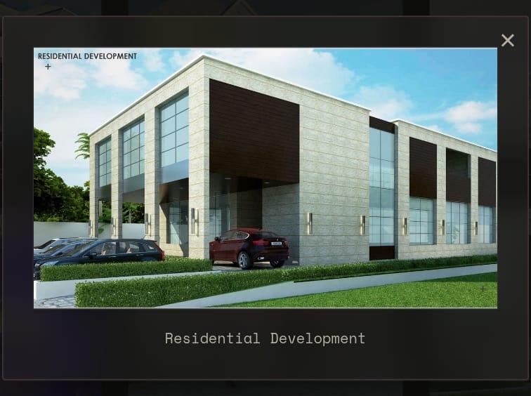
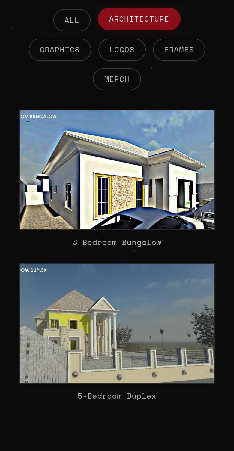
It had to show the real work: fifteen projects in five categories, each opening in a lightbox.
The photographs, names and copy came from the studio; the site had to show them well and make it easy to get in touch.
tara-designs-creative.vercel.app
A-03 / A-08
The approach
Kept light: plain HTML, CSS and one script shared by all four pages. The gallery is a class toggle and a single lightbox.
A-04 / A-08
The decisions
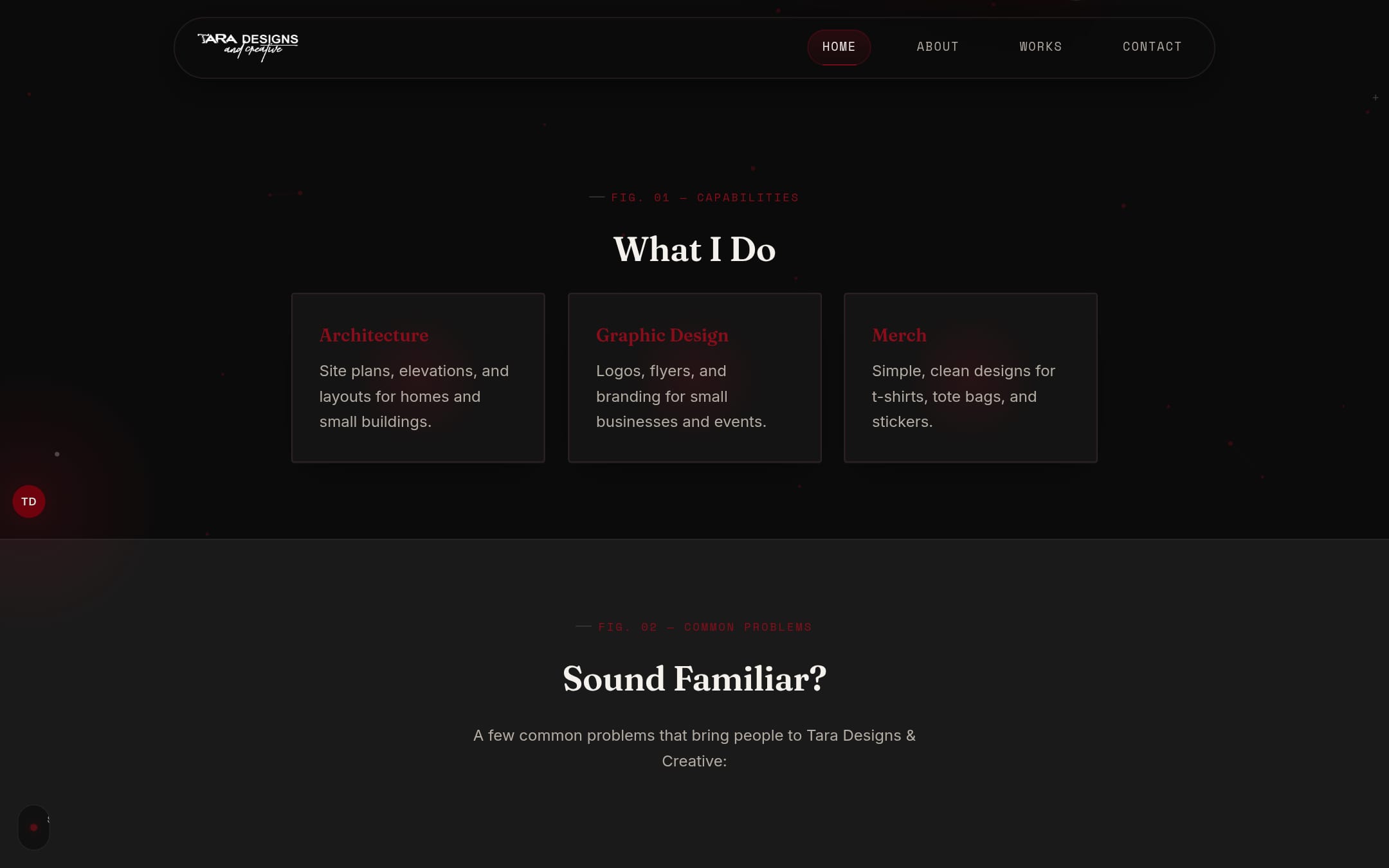
I chose the typography: Fraunces for headlines, Space Mono for the small labels and Inter for reading.
No framework and no build step: plain HTML, CSS and a single script shared by all four pages (it started as several and was merged into one).
The contact form checks what was typed in the page before it sends it to Formspree.
The pointer effects only run for a fine pointer with no reduced-motion setting, and the network of dots was tuned for speed a day after the first version.
A-05 / A-08
The design
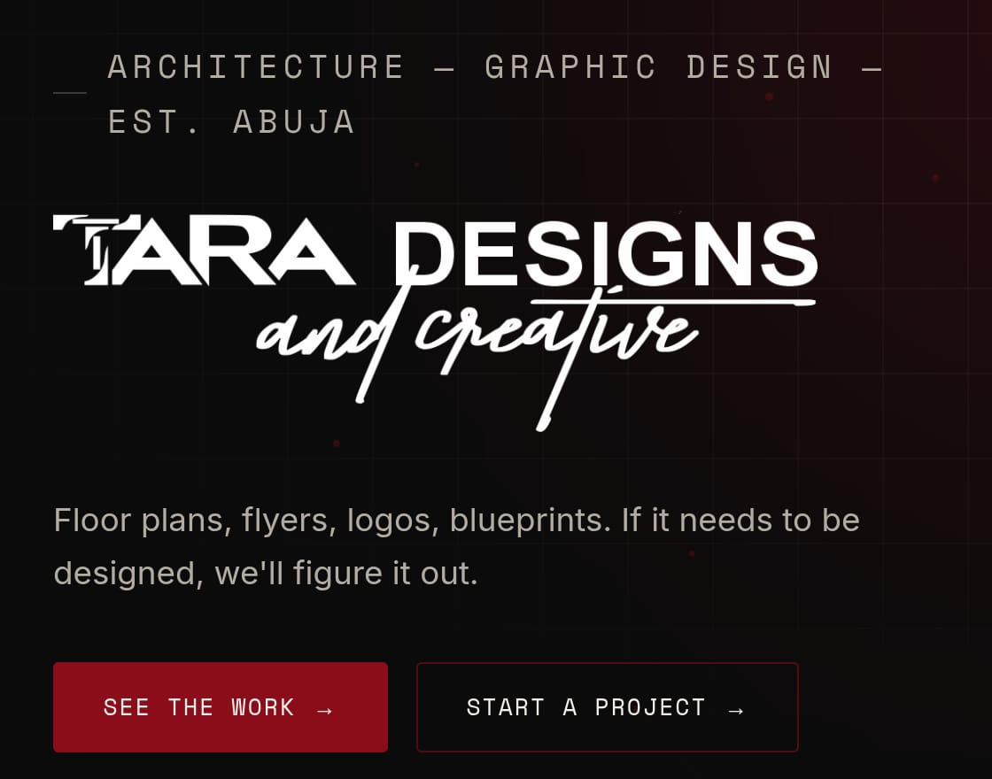
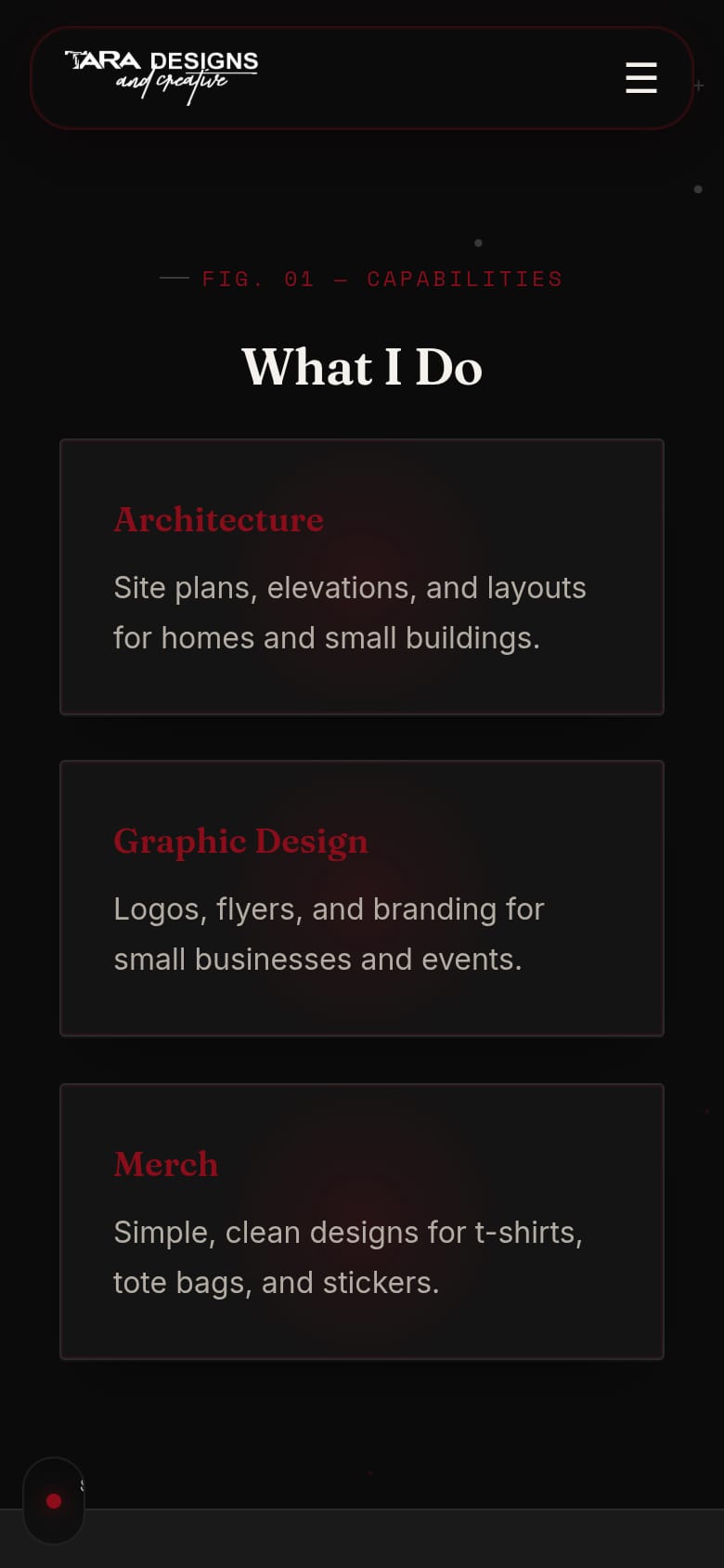
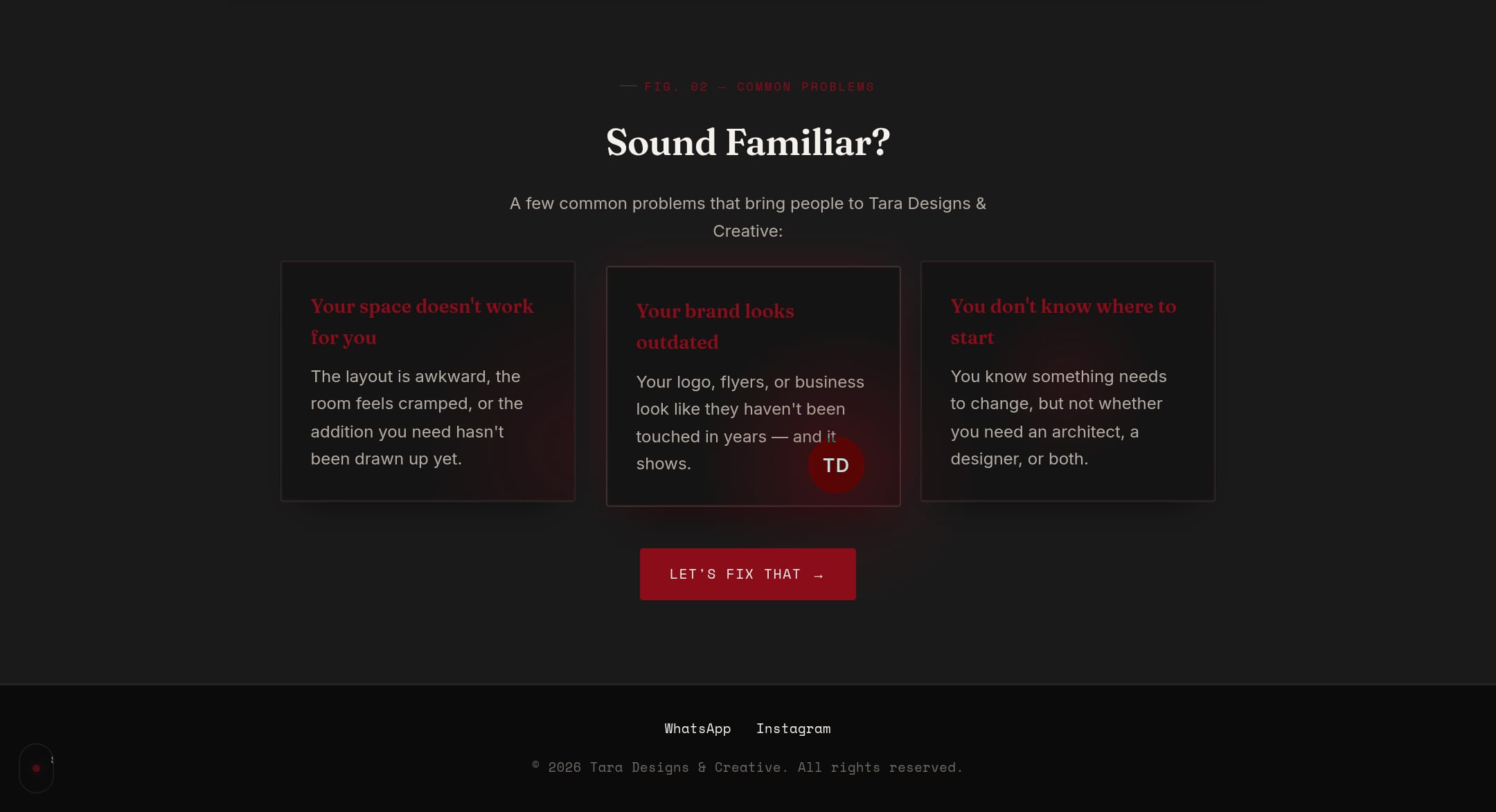
A dark, blueprint-like surface with one crimson accent. Sections are labelled like the figures in a set of drawings.
tara-designs-creative.vercel.app
A-06 / A-08
The build
Plain HTML, CSS and JavaScript, with a canvas for the network of dots.
Pointer effects run only with a fine pointer and no reduced-motion setting.
It took three days from the first commit to the last: 25 commits between 28 and 30 August 2026.
- Pages
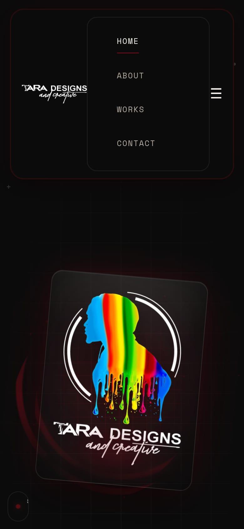
- Home, about, works, contact
- Gallery
- 15 projects, 5 categories
- Forms
- Checked, then sent to Formspree
- Type
- Fraunces, Space Mono, Inter
- Source
- Private repository
A-07 / A-08
The details
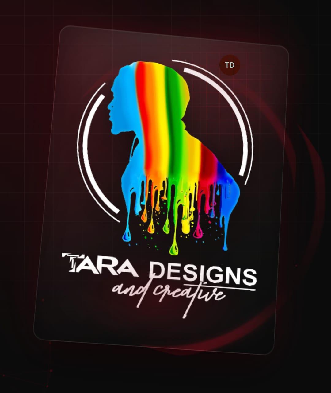
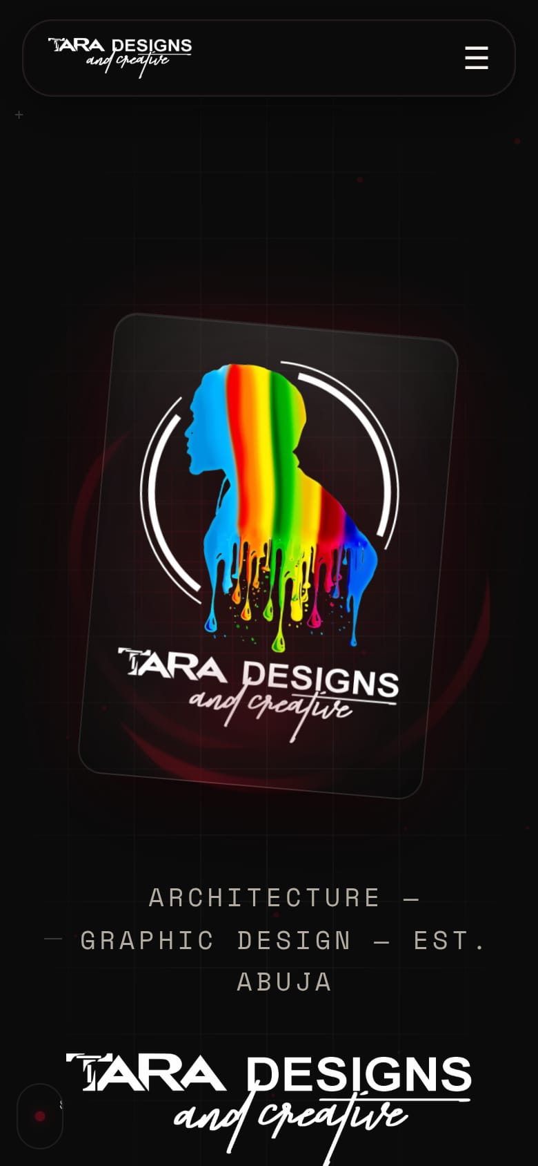
The logo card leans toward the pointer. A crimson spotlight follows the mouse across cards. Dots near the cursor move out of its way.
tara-designs-creative.vercel.app
A-08 / A-08
Current state
It works, and it’s live.
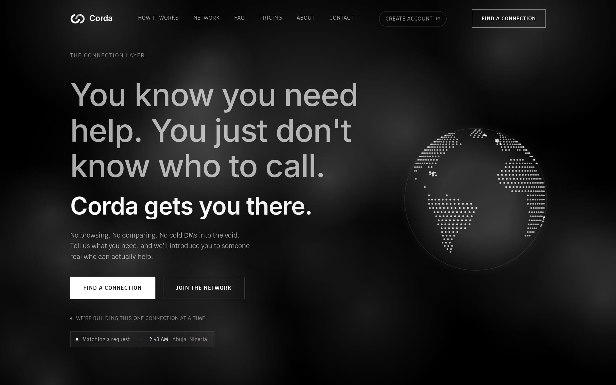
Next project Own venture, website and app, 2026
Corda